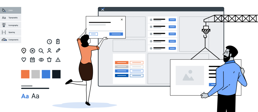
The demand for digital applications has risen rapidly over the past few years, and there is no end in sight to this trend. Every day, we come into contact with numerous websites, apps, and desktop applications, whether in our personal or professional lives. In short, billions of people interact with billions of applications every day. This steadily increasing demand is having a major impact on the way we understand design work. To continue operating efficiently and ensure a successful UX, work processes must be streamlined. This is where design systems can make a valuable contribution—and that is exactly what our UX and UID experts are focusing on today.
What Are Design Systems?
A design system establishes a set of standards for managing design at scale. At its core are the reduction of redundancies and the management of reusable components and patterns. Design systems enable a unified language and visual consistency across all touchpoints.
Essentially, a design system consists of two parts: the design repository and the people who manage it. Simply put, the design repository serves as a storage location for all components and assets needed to create a consistent and effective design. These are typically represented in the design repository as a style guide, a component library, and a pattern library.
Style Guide
Style guides contain specific guidelines for the visual and linguistic implementation of design solutions. They often focus on branding. The use of colors, typography, logos, etc., plays an important role here. In terms of language, they primarily provide recommendations for the appropriate tone and the consistent use of specific terminology. In addition, they often include visual references, design principles, and interaction design standards for interface design.
Component Library
These libraries contain a collection of UI components. These are reusable code blocks representing various UI elements, such as buttons, dropdowns, or icons. Creating such a library requires a significant investment of time, but it can be well worth the effort. This allows both designers and developers to access it to familiarize themselves with specific UI components and use them appropriately. The components are generally designed to be flexible and customizable. This makes them ideally suited for use in various contexts and applications. Their reusability makes them an efficient tool that also ensures linguistic and visual consistency, accurately reflecting the product and corporate vision.
Pattern Library
Like a component library, a pattern library is a code library. However, while a component library typically contains individual UI components, a pattern library contains so-called patterns, which are composed of multiple UI components. Patterns are particularly well-suited for improving usability and include, for example, navigation bars with logos, links, search forms, or CTA buttons. In everyday use, however, the lines between style guides, component libraries, and pattern libraries sometimes blur, and the terms are used interchangeably.

It’s also important to note that a design system is neither a style guide nor a component library nor a pattern library. These are the individual components that make up a design system. Furthermore, implementing a design system also requires a great deal of input from other areas, such as UX recommendations, developer documentation, and brand guidelines.
Implement a design system?
If you want to use a design system in your own company, three keywords in particular come up during your research: Adopt, Adapt, Create. These are three different ways to implement a design system. Depending on the use case, one approach may be more suitable than another.
If you want to keep costs relatively low, the “adopt” approach is the best option. This involves fully adopting an existing design system. This method also requires the least amount of time. However, a significant drawback is the limited—or even non-existent—ability to customize it.
The "Adapt" approach offers a middle ground. With this approach, an existing design system is adapted to the company's requirements and needs. It is more cost-effective than developing a design system entirely from scratch, yet still offers opportunities for customization.
However, if adjustments need to be made on an ongoing basis—and on an ever-increasing scale—developing your own design system may well be worthwhile. This option is called “Create,” and despite its high cost and time investment, it can be more cost-effective in the long run than the other two.
If you decide to develop your own design system, it’s a good idea to take a closer look at Brad Frost’s Atomic Design—which has become the standard among many designers over the years. The basic idea behind this method is that complex design solutions can be achieved by combining simple, reusable components. The model is based on chemical concepts and structures UI elements into the following building blocks: design tokens, atoms, molecules, organisms, templates, and pages.

- Design tokens: These are the smallest building blocks and describe the properties of an atom. They refer to recurring design elements that define the style of an entire application, such as colors, spacing, or typography. When implemented, they must always be linked to at least one atom, since they do not fulfill any UI function on their own. Defined as data in a JSON file, they can be used across platforms.
- Atoms: These are the smallest, self-contained building blocks of a design system, such as buttons, text labels, or input fields.
- Molecules: consist of atoms and form a standalone visual element within a group of UI elements—such as the combination of a text label, a search input field, and a button to create a search form.
- Organisms: are formed from various molecules or atoms into complex structures, such as headers, footers, maps, or lists.
- Templates: define the structure of the layout and the placement of organisms, molecules, and atoms on a page.
- Pages: are the final composition of all preceding building blocks, including content.
Atomic Design allows you to build a consistent and modular system that can be continuously expanded. Whether you’re creating your own design system or adapting an existing one, both approaches require a strong team to ensure successful implementation and management. The design system must be reviewed and maintained on an ongoing basis to ensure it remains up to date. The size of the team depends on the scope of the application. As a general guideline, the team should include at least one person each for interaction design, visual design, and software development. This ensures that the necessary guidelines and examples—including code snippets—can be provided for every UI element.
How We Work
As a provider of custom software solutions, we encounter two different scenarios in our day-to-day work. Either our clients do not yet have their own design system, or they already have initial designs or their own design system, which then serve as the basis for our work.
As a rule, for clients who do not have their own design system, we work with them to build one in parallel with the features being developed. Implementing a design system early in the project makes it easier for us to create, for example, high-fidelity prototypes, handover materials for developers, and documentation. This approach allows us to respond quickly to unexpected changes in the concept or requirements. Adjustments to colors or fonts (e.g., based on user testing results) can be implemented without significant time investment. Design systems are a valuable complement to our agile way of working, which follows the principle Inspect and Adapt in all its forms.
Once the product is finalized, we also hand over the design system. Our customers thus receive a well-documented and user-friendly tool for further developing the existing product or implementing new applications.
If, on the other hand, our clients already have initial designs or their own design system, we familiarize ourselves with the existing content and draw on it to implement the desired application. In these cases, we typically work with our project partner’s in-house UXD department. The product is developed through close collaboration and ongoing communication. New components or adjustments always undergo a thorough review process before they can be implemented into the final design.
In our design work, we’ve found that the advantages and disadvantages of a design system vary depending on the use case. However, regardless of which approach you choose when implementing a design system, it’s generally true that it serves as a single source of truth. All rules and building blocks for implementing visual and linguistic design solutions are contained within it and serve as a basis for decision-making. This also brings other benefits, such as the clear organization of all UI elements in one place and the elimination of redundancies. Furthermore, they provide a common working foundation for cross-functional teams, can be quickly adapted, and help increase efficiency.
Depending on the project, however, it’s always a good idea to consider whether the initial effort required to build a design system is actually necessary or worthwhile, since sometimes a style guide is sufficient. Despite these concerns, design systems are a valuable tool for ensuring a consistent product and brand identity, as well as for delivering a successful UX.
Sources:
https://atomicdesign.bradfrost.com/table-of-contents/
https://bradfrost.com/blog/post/extending-atomic-design/
https://www.nngroup.com/articles/design-systems-101/