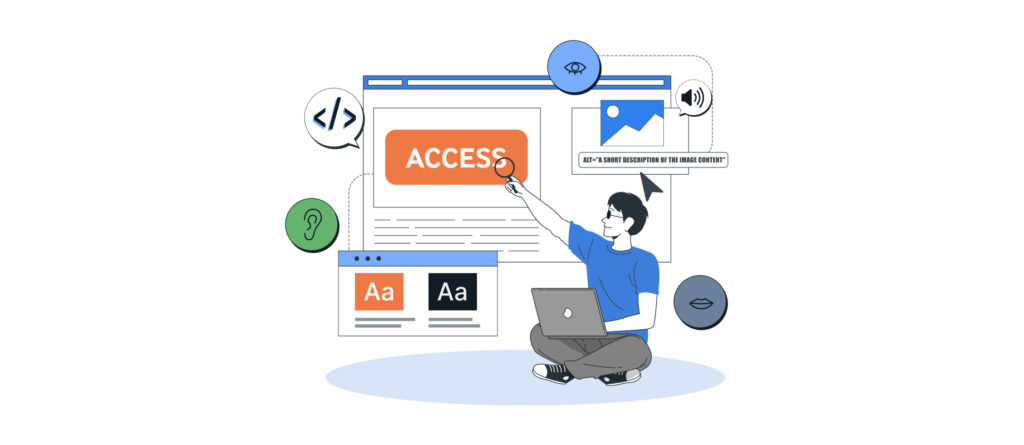
Digital accessibility is increasingly becoming a fundamental requirement of modern software development. This is due to legal requirements, but also to clear expectations within companies: applications should be reliably usable by as many people as possible. In one of our recent posts, we described why accessibility is more important today than ever before. This article takes it a step further and shows how accessible Front-end Development We make it happen: in design, in code, and in testing.
Many applications fail not because of a lack of functionality, but because of implementation details. These details quickly become barriers when people use screen readers, are unable to use a mouse, or have limited perception of content. This isn’t just about permanent disabilities. Even temporary situations—such as a broken arm, glaring sunlight, or using a tool in a noisy environment—can create noticeable barriers.
Accessibility therefore does more than just promote inclusion. It improves overall product quality, reduces support costs, and enhances the versatility and long-term usability of digital products.
What Accessibility Means in a Digital Context
The term "accessibility" (often abbreviated as A11y) refers to measures that make digital products usable regardless of individual circumstances. The WHO estimates that approximately 16 % of the world’s population lives with a permanent or temporary disability. In a business context, accessibility often means fewer operational errors, more efficient work processes, more satisfied users, and a broader recruitment pool.
The key standards for accessible web development are the Web Content Accessibility Guidelines (WCAG). Their four principles, abbreviated as POUR:
- Perceivable,
- Operable,
- Understandable,
- Sturdy
They structure requirements and provide a solid foundation for design, architecture, and testing.
POUR in Practice: What Really Matters in the Front End
Perceivable: Content must be perceptible
For content to be accessible, it must function regardless of sensory limitations. This includes sufficient contrast, clear visual hierarchies, and alternative text for images. For audio and video content, captions and transcripts are also required.
Contrast issues are among the most common barriers. Color combinations that appear distinct to many people are often barely distinguishable to those with color vision deficiencies. Tools like the WebAIM Contrast Checker help you check contrast ratios early in the design process, rather than waiting until just before release.
Best Practices (Selected):
- Check contrast ratios according to WCAG (especially for text, icons, and focus states).
- Provide information beyond just color (e.g., additionally indicate error conditions with text or icons).
- Integrate alternative text into content processes (don't „add it later“).
Usability: Interactions must work—even without a mouse
Accessible interaction starts with full keyboard accessibility. It is essential for screen reader users, but it also supports power users who make thousands of keystrokes every day. The Tab key cycles through interactive elements one by one. This order should be logical and easy to follow. Artificial `tabindex` values are usually a red flag: They can distort the order and quickly lead to „focus jumps“ that are difficult to understand. A visible focus indicator is mandatory so that users know where they are at all times.
Example of a highly visible focus style:
Such adjustments not only clarify the focus but can also be designed to align with the brand.
Another powerful feature is skip links. They allow users to skip recurring navigation sections and go directly to the main content. This makes things much easier, especially in complex web applications.
Best Practices (Selected):
- Always keep the focus visible (do not remove it).
- Set the focus order to follow the DOM flow—that is, the order of the elements in the HTML.
- Use skip links and meaningful landmarks (e.g., main, nav).
Understandable: Content and interactions must be understandable
Accessibility does not require simplifying technical content. It requires clarity. This includes understandable text, consistent navigation, unambiguous labels, and precise error messages.
Forms, in particular, are a common pain point. When error messages simply say „Invalid“ or fail to explain what to do, support costs rise and conversion rates drop. Precise instructions reduce the need for follow-up questions and help all users—not just those with disabilities.
Best Practices (Selected):
- Formulate error messages specifically („Please enter your email address in the format name@domain.de“).
- Clearly mark required fields.
- Set the language correctly (e.g., lang=“de“), especially for mixed content.
Robust: Software must be compatible with assistive technologies
Robustness means that assistive technologies can rely on the application. Screen readers expect semantically correct HTML, consistent roles and attributes, and reliable focus logic.
A common mistake is the overuse of ARIA (Accessible Rich Internet Applications). ARIA is a standard for additional attributes in the code. It allows roles, states, and labels to be supplemented so that assistive technologies, such as screen readers, can correctly interpret custom components.
ARIA can provide support, but it does not replace native elements. A `div` remains a `div`, even if it is assigned `role=“button“`. Usability is achieved only through additional implementations (keyboard events, focus handling, states), which often remain incomplete.
That's why the guideline is: As much HTML as possible, as much ARIA as necessary.
Example:
instead of
<div onclick="submitForm()">Submit</div>ARIA is useful where HTML falls short: for example, with tabs, accordions, dynamic status messages, or complex widgets. Icon buttons are a perfect example of the effective use of ARIA labels. The difference in the code is minimal, but for users of screen readers, it makes a huge difference.
Example of icon buttons with `ariaLabel`:

The second button, which has no label, is practically invisible to screen readers. In the best-case scenario, the screen reader will read the icon font fallback „favorite“—an English term that may not be very helpful to many users. In the worst-case scenario, the button remains completely silent and is therefore inaccessible.

A clean solution for everyday project work: a dedicated wrapper component. It’s the perfect place to standardize ARIA labels. The wrapper enforces that the icon and label are required inputs. Accessibility thus becomes a basic requirement, not an option. This is how we prevent accessibility errors before they occur. For our icon button example, a sample component in Angular might look like this:
In practical terms, this means that an icon button will no longer be added to the codebase without an `ariaLabel`:
    <lovely-icon-button
        [ariaLabel]="'Dieser Artikel über Barrierefreiheit gefällt mir'"
        [icon]="'favorite'"
        (click)="handleLike()" />
Accessibility in the Development Process: From Design to Testing
Accessibility Must Start Early
Accessibility should not be treated as a requirement only at the end of a project. It is a quality standard that begins during the design process: navigation structure, language selection, orientation elements, color scheme, and information architecture.
At IT Sonix, accessibility is therefore taken into account early on. Our UXD team works closely with developers to embed semantic structures, clear interactions, and consistent focus logic right from the design phase. This saves time on discussions later on, reduces rework, and leads to UIs that are easier to test.
Technical Implementation: Semantics, ARIA, and Focus Navigation
Our experts rely on clean HTML, clearly defined roles, intuitive keyboard navigation, and targeted ARIA use cases. A well-designed focus flow is one of the most critical tasks here. Modals, dialogs, and overlays, in particular, require focus traps that direct focus to the dialog when it opens, keep it there while it’s open, and reset it correctly when it closes.
Component libraries can be a huge help here if they include solid accessibility fundamentals. Verified focus logic, tested interactions, and consistent ARIA patterns save time and reduce risk. Poor-quality libraries, on the other hand, shift problems to each feature team and make consistent accessibility unnecessarily difficult.
Testing: Accessibility as an Integral Part of Quality Assurance
Accessibility becomes sustainable when it is part of the testing setup. A proven approach is to supplement the Testing Trophy with a clear focus on accessibility:
- Static: Linter rules identify structural issues early on (e.g., missing labels, incorrect roles, invalid ARIA attributes).
- Integration: Playwright, when used in combination with axe-core, automatically checks key flows, interactions, and many WCAG-related rules.
- Manual: Keyboard navigation, screen reader checks, and visual evaluation complement automation, especially in cases where context and actual usage are crucial.
The effect is measurable: problems are identified earlier, feedback loops are shorter, and audits reveal real challenges rather than preventable routine errors.
Conclusion
Accessibility adds value: for companies, users, and long-lasting software products. It enhances usability, improves technical quality, and promotes an inclusive work environment. Those who prioritize accessibility today are better prepared for future legal requirements and create well-thought-out, versatile, and sustainable solutions with a bright future.
Software that excludes no one is not only more accessible, but simply better. Now is the time to act.