

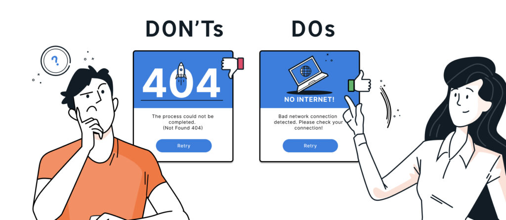
Error messages play a crucial role in the user experience (UX). A poorly designed error message can not only hinder usability but also cause frustration and confusion among users. In this blog post, we’ll therefore take an in-depth look at the importance of error messages in the field of UX. We’ll not only provide a guide to creating effective error messages but also delve deeper into the role of UX writing.
Why are effective error messages important?
Error messages are not only a way to inform users about problems, but also an opportunity to build trust between them and a system. Effectively designed error messages help users understand obstacles in the application, find solutions on their own, and feel supported in troubleshooting.
Problems with poorly implemented error messages:
- User frustration: Unclear or unhelpful error messages frustrate users and negatively impact their user experience.
- Loss of trust: Poorly worded error messages often undermine users' confidence in the application's reliability and quality.
- Process termination: Repeated negative experiences with error messages increase the likelihood that users will leave the application and look for alternatives.
Guidelines for Designing Effective Error Messages:
- Clear and understandable language: Using clear and simple language makes the content easier for the target audience to understand. Technical jargon and complex phrasing should therefore be avoided.
- Identify solutions: It is important not only to provide information about the error, but also to offer clear instructions on how to fix it. Users should be shown how they can resolve the problem on their own.
- Highlighting the problem: Clearly identifying the main problem and avoiding an overload of information helps keep the focus on the root cause.
- Positive phrasing: Error messages should be phrased in a positive and constructive manner. Instead of „Incorrect password,“ for example, the microcopy (small text elements within an application) „Password does not match“ could be used.
- Taking Context into Account: The user's context must be taken into account, and error messages should be tailored accordingly. For example, an error message for users who are unfamiliar with the system might be worded differently than one for experienced users.
The Role of UX Writing:
UX writing plays a crucial role in designing effective error messages. We have therefore compiled a list of key considerations to keep in mind:
- Show empathy: Empathetic text helps reassure users that they are understood when a problem arises. Therefore, compassionate language should be used when writing it.
- Maintain consistency: The language used in error messages should match the overall tone of the application or website. Consistency helps users feel more at ease.
- Test and Iterate: Good text requires iteration, so it's helpful to try out different versions of error messages. User feedback provides valuable insights into how messages can be improved.
By the way, you can find out more about UX writing from our experts here.
Effective error messages are not merely technical notifications; they offer an opportunity to communicate with users. Messages that engage users in conversation foster a stronger connection to the product. By incorporating clear UX writing and careful design, error messages can become a positive element in the overall user experience of an application.
Our experts have developed an example to demonstrate how to create a targeted and meaningful error message.
Example of an effective error message:
Problem: The user tried to log in to their account, but the passphrase they entered is incorrect.
Proposed solution: Check that the capitalization is correct. If you have forgotten your password, use the ‚Forgot Password‘ option.
This microcopy already largely meets the requirements for a good error message. However, to achieve the best possible result, it should still be reviewed for the following points and revised as needed.
Empathetic tone: Does the error message make users feel that they are being understood?
Contextual sensitivity: An incorrect passphrase entry can have various causes depending on the user's experience. Are these factors taken into account in the error message?
An effective error message should therefore not only identify the problem but also provide clear instructions on how to resolve it, sound empathetic, and address the user's context. This minimizes frustration while improving usability.
So what would an ideal error message for our problem look like?
Solution: „We're sorry, something went wrong. Unfortunately, your password is incorrect. Please check again to make sure you're using the correct uppercase and lowercase letters. If you've forgotten your password, click ‚Forgot Password.‘“
Of course, you should always consider how much information is truly useful at this point. The rule of thumb is: as much as necessary, as little as possible! The goal is to avoid forcing users to wade through a long text before they can understand the problem and find a solution. If you’re unsure, it’s advisable—as in all other areas of UX—to use various evaluation methods and gather user feedback.
For anyone who would like to delve a little deeper into the topic, we recommend the new German UPA Guide.