The demand for digital applications has grown rapidly over the last few years and there is no end in sight. Every day, we come into contact with countless websites and apps as well as desktop applications, whether for private or professional use. In short, billions of people interact with billions of applications every day. The ever-increasing demand is having a major impact on the way we understand design work. In order to continue to operate efficiently and ensure a successful UX, work steps must be streamlined. Design systems can make a valuable contribution here, and this is exactly what our UX and UID Xperts are dealing with today.
What are Design Systems?
A design system establishes a set of standards for design management on a large scale. At its heart are reducing redundancy and managing reusable components and patterns. Design systems allow visual consistency and a common language across all touchpoints.
A design system consists of two parts, the design repository and the people who manage it. Simply put, the design repository serves as a storage location for all components and assets that are necessary for the realisation of a consistent and effective design. These usually find their equivalent in the design repository as a style guide, component library and pattern library.
Style Guide
Style guides contain concrete guidelines for the visual and linguistic realisation of design solutions. They often focus on branding. The use of colours, typography, trademarks, etc. play an important role here. Linguistically, they mainly give recommendations for the right tone of voice and consistent use of certain terminology. In addition, they often include visual references, design principles and interaction design standards for interface design.
Component Library
UI components are collected in these libraries. They are reusable code blocks of different UI elements such as buttons, dropdowns or icons. Creating such a library requires a considerable amount of time, but it can be worthwhile. Designers and developers alike can access it to familiarise themselves with certain UI components and use them accordingly. The components are usually designed to be flexible and customisable. This makes them ideally suited for use in different contexts and applications. Their reusability makes them an efficient tool that also ensures linguistic and visual consistency and adequately reflects the product and company vision.
Pattern Library
Like component libraries, pattern libraries are code libraries. While component libraries typically contain the individual UI components, pattern libraries contain so-called patterns that are composed of several UI components. Patterns are particularly suitable for improving usability and are, for example, navigation bars with a logo, links, search forms or CTA buttons. In everyday use, however, the boundaries between style guides, component libraries and pattern libraries sometimes become blurred and the concepts are used synonymously.

It is important to note that a design system is neither a style guide nor a component library or pattern library. These are the individual components that make up a design system. In addition, the implementation of a design system also requires a lot of input from other areas such as UX recommendations, developer documentation and brand guidelines.
How to implement a Design System
If you want to use a design system in your own company, you will come across three key words in the research: adopt, adapt, create. They are three different ways of implementing a design system. Depending on the application, one variant may be more suitable than another.
If relatively little money is to be invested, the adopt variant is best suited. Here, an existing design system is adopted in its entirety. This method also requires the least amount of time. A considerable disadvantage, however, are the limited or even non-existent customisation options.
The adapt variant offers a middle ground. Here, an existing design system is adapted to the requirements and needs of the company. It is more cost-effective than developing a design system completely on one's own and still offers options for individualisation.
However, if adjustments have to be made on an ongoing basis and to an ever-increasing extent, the development of an independent design system can be quite worthwhile. This variant is called create and can be more profitable than the other two in the long run, despite its high cost and time expenditure.
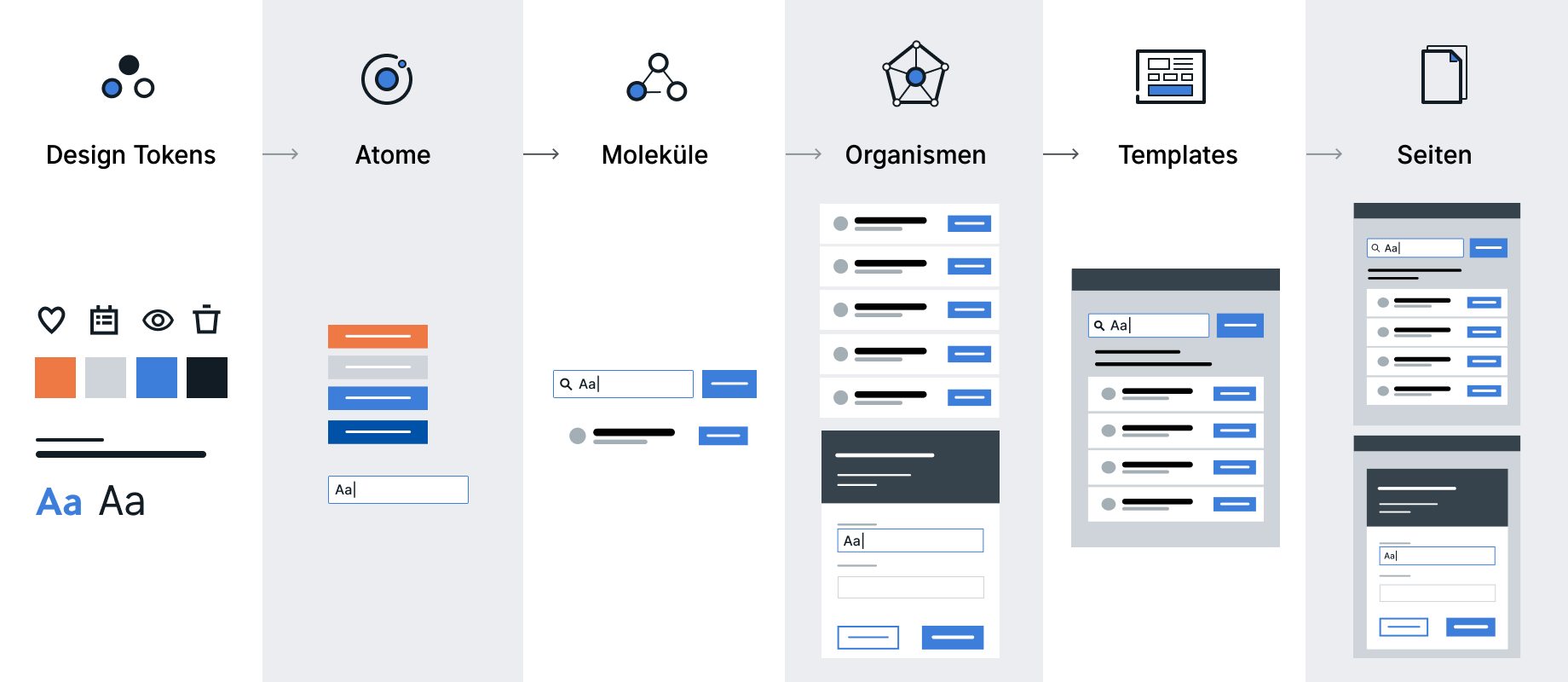
If you decide to develop your own design system, it is advisable to take a closer look at Brad Frost's Atomic Design - which has established itself as a standard among many designers over the years. The basic idea behind this method is that complex design solutions can be realised by combining simple and reusable components. The model is based on chemical concepts and structures UI elements into the following building blocks: Design tokens, atoms, molecules, organisms, templates and pages.

- Design Tokens: are the smallest components and describe the properties of an atom. They refer to repetitive design elements that define the style of an entire application, such as colours, spacing or typography. In their implementation, they must always be bound to at least one atom, as they do not fulfil a UI function on their own. Defined as data in JSON, they can easily be used across platforms.
- Atoms: form the smallest meaningful building blocks of a design system, such as buttons, text labels or input fields.
- Molecules: are composed of atoms and form an independent visual element from a group of UI elements such as the combination of a text label and a search input and a button to construct a search form.
- Organisms: form themselves into complex elements from different molecules or atoms, such as headers, footers, cards or lists.
- Templates: set the structure for the layout as well as the placement of organisms, molecules and atoms on a page.
- Pages: are the final composition of all preceding building blocks including content.
With atomic design, a consistent and modular system can be built that can be continuously expanded. Whether you create your own design system or adapt an existing one, both require a good team for successful implementation and management. The design system must be constantly checked and maintained so that it is always up to date. The size of the team depends on the scope of the application. As a guideline, the team should include at least one person each for interaction design, visual design and software development. This way, the necessary guidelines and examples, including code snippets, can be provided for each UI element.
How do we work?
As a service provider for customised software solutions, we encounter two different scenarios in our daily business. Either our customers do not yet have their own design system or they already have initial designs or their own design system, which then form the basis of our work.
For clients who do not have their own design system, we usually set one up in consultation with them in parallel with feature development. The early implementation of a design system in the project makes it easier for us to create high-fidelity prototypes, handovers for developers and documentation. This procedure enables us to react quickly to spontaneous changes in the concept or the requirements. Adjustments to colours or fonts (e.g. from user-testing results) can be implemented without considerable time expenditure. Design systems are a valuable addition to our agile way of working, which follows the principle of inspect and adapt in all its forms.
With the finalisation of the product, we also hand over the design system. Our customers thus receive a well-documented and clear tool for the further development of the existing product or for the realisation of new applications.
If, on the other hand, our customers already have initial designs or their own design system, we work our way into the existing content and draw on this for the implementation of the desired application. In these cases, we are usually dealing with an in-house UXD department of our project partner. The product is realised in close cooperation and constant exchange. New components or adaptations always go through a precise review process before they can be implemented in the final design.
In our design work, we have experienced that the advantages and disadvantages of a design system differ depending on its application. In principle, however, regardless of which path is chosen in the implementation of a design system, it functions as a single source of truth. All rules and building blocks for the implementation of visual and linguistic design solutions can be found in it and serve as a basis for decision-making. This also brings other advantages, such as the clear structuring of all UI elements in one place and the avoidance of redundancy. They additionally form a common working basis for cross-functional teams, are quickly adaptable and increase efficiency.
Depending on the project, however, it is always advisable to check whether the initial effort to build a design system is necessary or worthwhile at all, as sometimes a style guide is also sufficient. Despite these caveats, design systems are a valuable tool for a uniform product and brand appearance as well as the implementation of successful UX.
Sources:
https://atomicdesign.bradfrost.com/table-of-contents/
https://bradfrost.com/blog/post/extending-atomic-design/
https://www.nngroup.com/articles/design-systems-101/
