.jpg)
When it works, we hardly notice it and yet it plays a significant role in the success of a digital product: language. In the best case, it provides us with all the necessary information to interact successfully with a website or application - in other words, it ensures a positive user experience. In this context, it is part of the user experience and its successful implementation is currently known as UX writing.
In the advertising space, many companies have already recognised that the key success factors of a product, such as trust in a brand, are primarily communicated through language. A good product can convince with good language. However, UX writing is not primarily about selling something, but about equipping a product with its complete functionality. Imprecise texts on websites or in applications clearly miss their target: successful use by their users.
That's exactly why today our UX and UID Xperts are shining their spotlight on this not-to-be-neglected discipline within user experience design.
Microcopy
However, before we look at the methods and tools for successful UX writing, we would first like to define our working material more precisely - the text. In UX writing, we do not encounter this in the form of large prosaic text areas, but for example on buttons, as labels, short help texts, user prompts or button texts.
Often these are single words rather than complete sentences. In UX writing, we call this type of text microcopy. It refers to the many small text modules that are necessary for a successful interaction between a digital product and its users. Good microcopy helps users to keep their orientation and guides them through the product – bringing them to their goal as comfortably and with as few detours as possible.

Before a successful microcopy can be created, however, a lot of knowledge is needed - about the product as well as about the users. This is where methods already learned from user experience design, such as design thinking, come into play. It is therefore not only helpful but also advisable to involve UX writers in the product development process right from the start, together with UX/UI designers, product owners and developers.
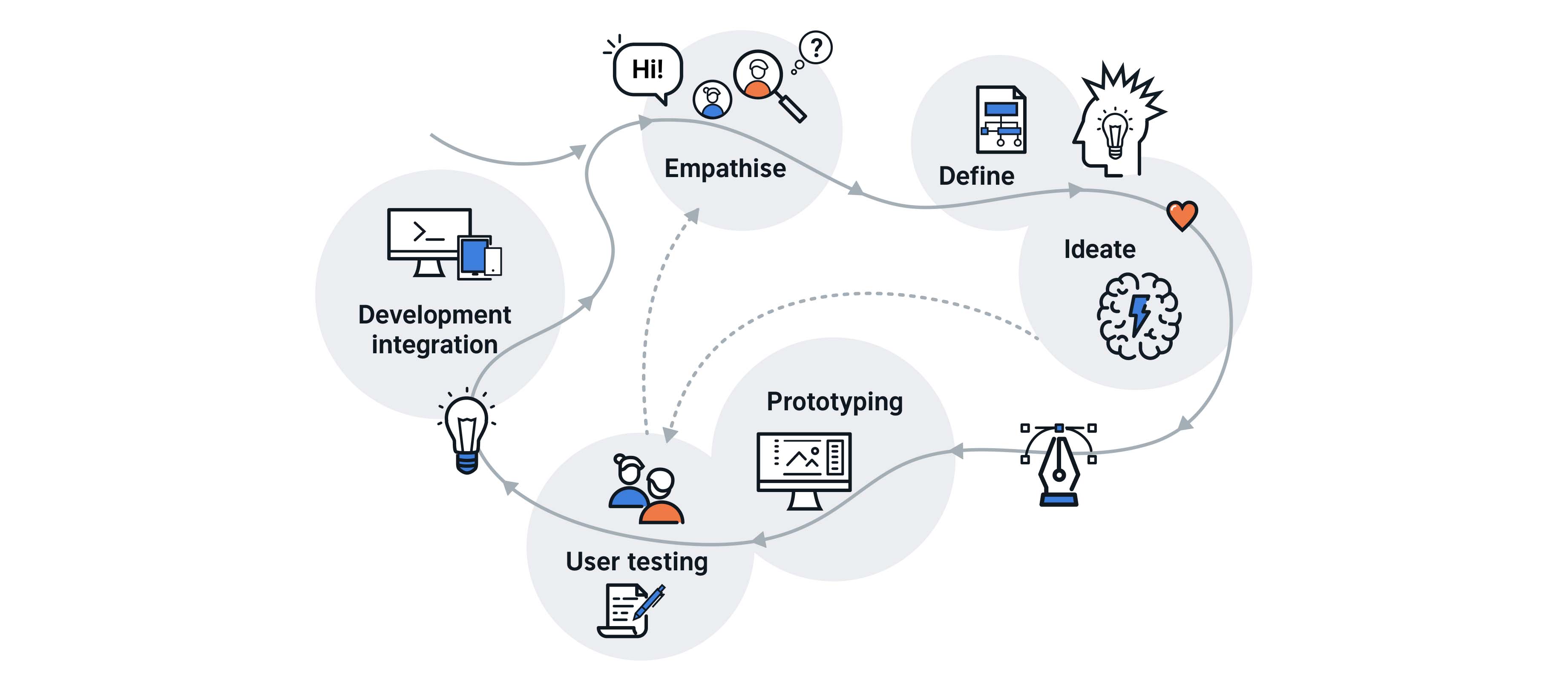
Design Thinking

Design thinking is a creative innovation process that places people and their needs at the centre of product development. In this method, the perspective of the users is taken in order to design ideas that solve their problems in the best possible way. Such a perspective is particularly important for UX writing. Successful UX conducts a dialogue with the users that leads them to the desired result at the end of their interaction. Adopting the user's perspective allows important principles for successful UX writing to be derived. If users are to find their way around a digital product and reach their goal as quickly and with as little frustration as possible during their interaction, it is best to adhere to the following guiding principle when creating good microcopy: good microcopy should be clear, concise, useful, consistent and friendly.
Depending on the interaction between the digital product and the user, these five guiding points should be taken into account with different weighting. For example, the shortest possible version of a microcopy will not always be the most useful one. The creation of good microcopy is therefore always an iterative process. It goes through several stages until it has reached its most useful form.
In the implementation and weighting of these five guiding points, the following basic assumptions have proven to be particularly helpful in our processes with the help of Design Thinking. Regardless of the microcopy, the name should always be unambiguous, i.e. clear. When it comes to providing information, its length can vary depending on the purpose of the microcopy. However, the basic rule is to provide only as much information as is necessary at that moment of interaction. For example, sometimes it may be more helpful to use one more word and in other cases not. Perhaps the most important point, however, is that no matter which interactions are given a microcopy, these terms must be consistently used. If different terms are used for the same interaction in a digital product, the microcopy is neither clear nor concise and, above all, not useful. In order to fulfil its purpose of ensuring a positive user experience, microcopy needs to be tied to the user's perspective and the product's purpose.
Closely linked to these four principles is a fifth. People expect a certain basic level of human behaviour from machines. The very fact that we develop our digital products according to a user-oriented design process means that this aspect is taken into account in our work. Successful microcopy should therefore be aligned as far as possible with basic human needs and expectations of communication and follow human logic. This prevents users from being irritated by a digital product whose purpose is not clear to them due to a lack of user-friendliness, leaving them disoriented and frustrated.
However, the language from which good microcopy and thus also good UX writing draws is not only one that needs to be defined from scratch. In many companies, for example, there is already a language or tonality that defines products and company culture and comes from marketing. UX writers use this and adapt it for their work. The goal is always to create a positive user experience.
Methods & Tools
The following methods and tools are particularly suitable for creating good microcopy: voice charts, terminology tables and copy templates.
The voice chart translates the product principles into linguistic rules. It is a kind of overview table that determines how the texts of a digital product should be formulated. It contains information about the desired tone, the level of language, the choice of words as well as grammar rules to be taken into account when writing a microcopy. Voice charts reflect on the absolute basic functions and corporate values of a digital product. They serve as the highest decision-making basis for competing microcopy drafts.
Whether as a basis for a voice chart or as a tool of its own – a terminology table is a valuable tool for consistent language use. All specialist terms and technical terms are collected here and provided with concrete examples of use and possible synonyms. Terminology tables not only support a consistent corporate identity, but also make a valuable contribution to the orientation of users within the digital product.
Finally, there is also the option of integrating copy templates into UX writing. These can be developed on the basis of a voice chart and a terminology table and provide entire text templates including use cases. Whether error messages, help texts, notifications or, for example, status messages, ideally there is a corresponding microcopy for everything.
Copy templates make UX writing much easier. They support consistent language use and at the same time increase efficiency throughout the entire design process. For example, UX designers can already use them during their first drafts. An interplay between UX writing and UX design that is conducive to the entire digital product is created and often evolves into a larger concept - for all those involved in the development process.
How do we work?
Using one of our electric car sharing projects as an example, we would like to show examples of successful microcopy in a mobile app. By means of automated identification verification, users can quickly register and use the electric cars. The opening and closing of these vehicles is done via the app and payment of parking tickets is done automatically. For all this to work smoothly, a good UX is needed - in design and in language.
Our first example is about consistency. Throughout the application, we use a button called "Agree" to confirm a process that requires the user's consent. The use of other labels, such as "Confirm", could cause irritation or, in the worst case, lead to users abandoning the interaction.
In the same way, we always use the term "driving licence" for the required document in the registration process. An inconsistent designation that alternates between "driving licence" and "driving permit" would not only cause potential confusion, but would also affect the credibility that this is a trustworthy application.
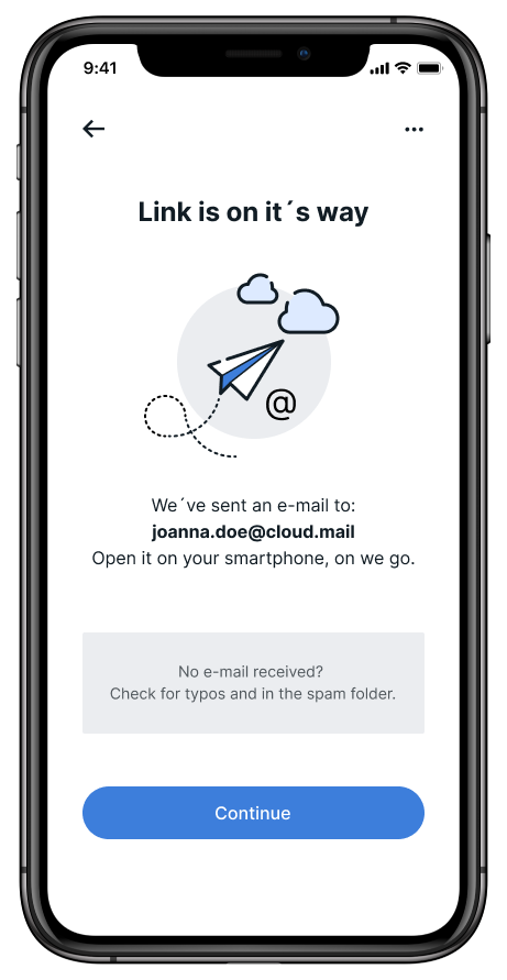
At many points in our application, we have also integrated short help texts that inform users about processes and possible solutions. These are not only useful, but also have a friendly impact, so that users enjoy navigating through the application. In addition, they also fulfil a basic requirement that people place on communication: We expect a certain degree of helpfulness from our counterparts.

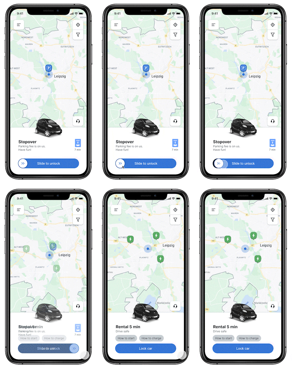
Often, one word is enough to clearly interpret an interaction or a process. For example, We used the microcopy 'Slide to unlock' on the button used to unlock the electric vehicles. If a vehicle is being charged, the microcopy "Charging" appears in addition to the charging symbol. Images and symbols can be understood in different ways.

Good microcopy minimises ambiguity and gives users clear information about specific interactions and their implications, while being concise, useful, consistent and friendly.